Using Addons
Storybook comes with a variety of “core” addons developed and maintained alongside Storybook. Most examples in this site use actions and links. But you can use any third party addons distributed via NPM.
Here’s how to do it.
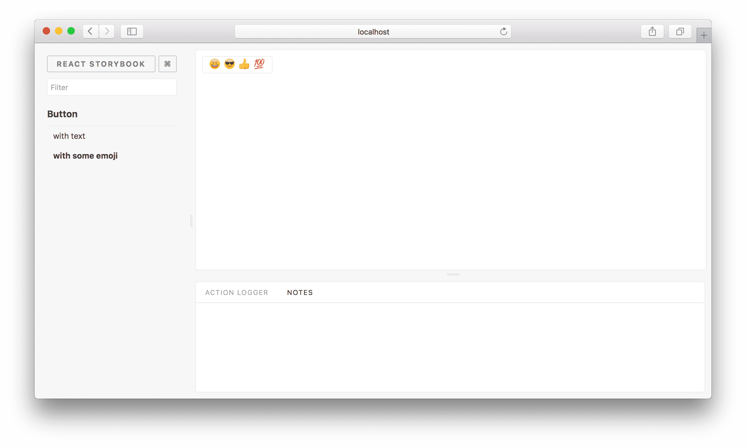
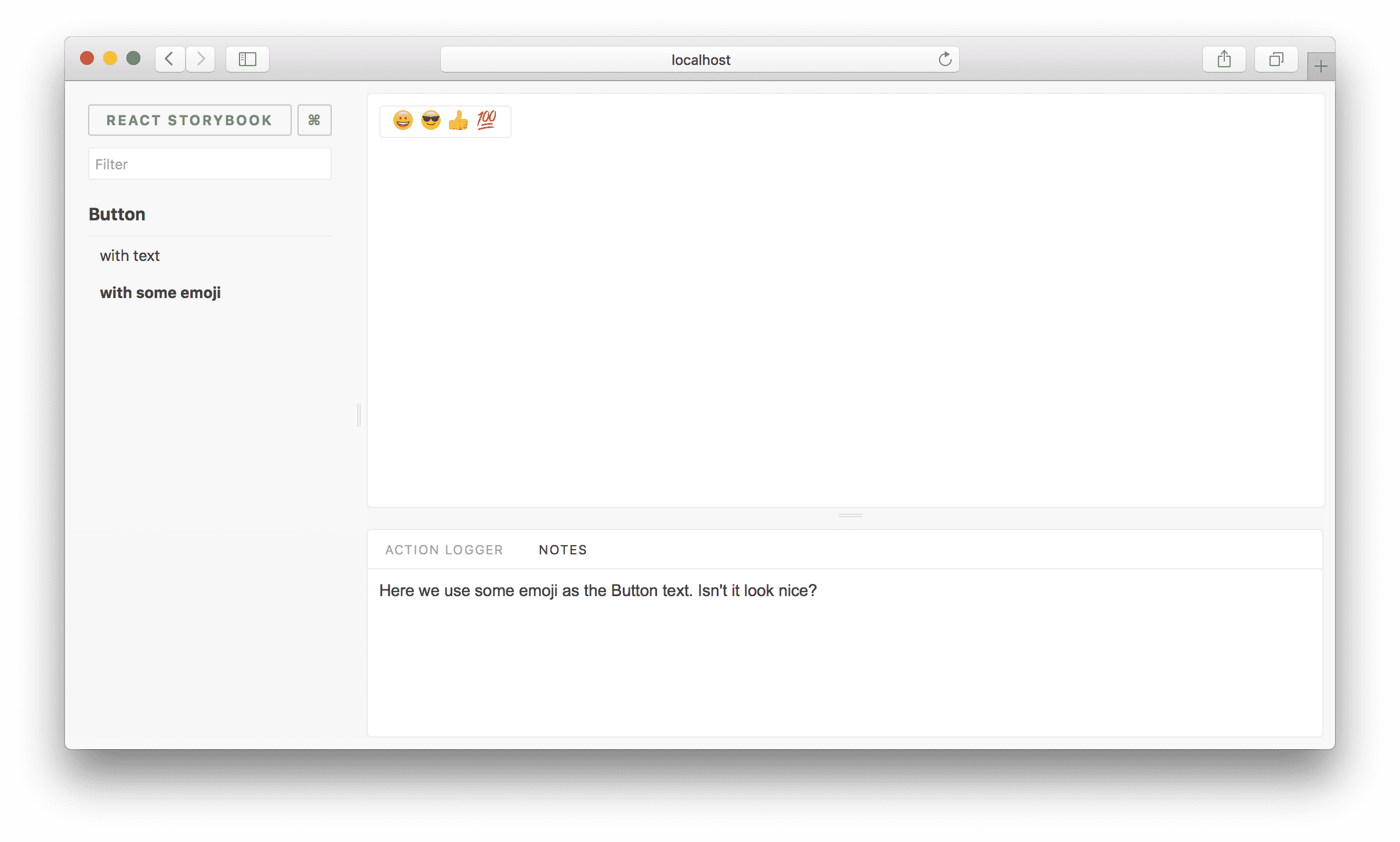
We are going to use an addon called Notes. Basically, it allows you to write notes for your stories.
First, we need to install the addons:
within .storybook/main.js:
Once created, you’ll have to restart storybook to make the underlying webpack aware of the addons file.
This will register all the addons and you’ll be able to see the actions and knobs panels (in that order) when you are viewing the story. (Links do not register a tab—check individual addon docs to see which Storybook features they use!)
Addons tab order
The tab order is created by order in which they appear in the array in the main.js file.
Using the addon
Now when you are writing a story, you can import the actions addon to log actions. Also, you can add notes:
Then you’ll be able to see those notes when you are viewing the story.
Disable the addon
You can disable an addon panel for a story by adding a disabled parameter.
Global Configuration
Sometimes you might want to configure an addon globally, as in the case of collocating stories with components, or to keep your stories file cleaner. To do that, you can add your decorators to a config file, typically in .storybook/preview.js. Here’s an example of how you might do that.
Just like this, you can install any other addon and use it. Have a look at our addon gallery to discover more addons.

